Fatigue Indicators
I’ve been a bit concerned about one of the cyclists I coach. He’s in his late 50s and is very focused on his training and racing this season. He's a strong rider. Last week on his Tuesday evening, group ride he was dropped twice. That’s very unusual for him.
He and I could see things weren’t right, and so we cut back on training fairly dramatically for the last three days before his race last weekend. I hoped that would do it. It didn’t. That Saturday, in his first road race of the season, a B-priority, he couldn’t hold the wheel of his chase partner on a climb. So he dropped back to the second group where he finished. It wasn’t a very good start to his season.
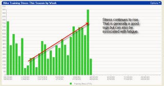
Here are some of the things we should have caught earlier and made adjustments. All of these charts come from my WKO+ software, which I rely on a lot in coaching. This chart shows the increase in his weekly, cumulative Training Stress Score over the course of this season so far. You can see weeks where we cut back on training to allow for rest. But the big mistake appears to have been in March. There you can see four weeks of fairly high stress sandwiched by two rest and recovery weeks. In retrospect we tried to cram in too much training load to take advantage of some warm days (he lives in a very cold and snow-packed location). That was a mistake. The high TSS week on the right is his race week and most of that spike comes from the race.
 This chart shows his power distribution by zones for the last 28 days leading up to this race (on the right) and the same 28-day period from last year (on left). In the right-hand chart notice the spike in zone 3 (“TE”) power relative to 2007’s zone 3. It’s hard to tell without knowing the numbers but what happened here was that his zones 4 (“TH”), 5 (“VM”) and 6 (“AC”) power are lower this year at this time. Essentially, it appears he has been spending a lot of time in zone 3 and less in zones 4, 5, and 6. I expect we’d find that someone who is tired would do that. Working at what feels like a hard effort would produce zone 3 power a lot of the time. His training and workouts during this 28-day period were essentially the same as during last year’s.
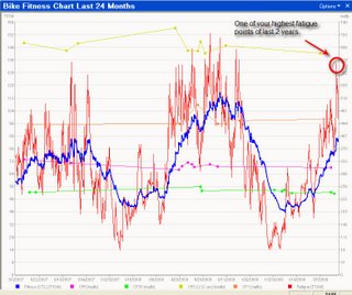
 Here you can see his Performance Management Chart for the last 24 months. This is perhaps the most telling of all. The blue line represents his fitness (“Chronic Training Load”) while the red line represents fatigue (“Acute Training Load”). The right side of the chart takes him up to the race described above. Notice how his fatigue has been climbing fairly steadily since November. It closely matches what we see in his TSS chart above. The week of the race he was experiencing his highest fatigue of the year, and one of his highest fatigue levels in the last two years. Before this same race last year his fitness was about 22% lower by this same weekend, as was his fatigue.
The bottom line is we made a mistake in his training when we decided to take advantage of the warm weather back in March. And this was exacerbated by a lot going on in his off-the-bike life. There was simply too much stress load without allowance for it to subside. As his coach, this is my fault. It goes against everything I preach about the periodic need for rest and recovery. There’s a lot more to the story, but it’s sufficient to say here that this won’t happen again. He is now resting some more to be ready for this weekend’s race. If this doesn’t do it then he’s in for even more rest next week. It simply doesn’t pay to take shortcuts.


